Data visualization
Summary
Data visualization can be helpful at many stages of the research process, from data reporting to analysis and publication. Relative to regression tables, cross-tabs, and summary statistics, data visualizations are often easier to interpret, more informative, and more accessible to a wider range of audiences. This resource discusses key considerations for creating effective data visualizations and provides guidance for making design choices. We present some common graphic options and include further resources to explore this topic, including sample code on J-PAL's github.
Data visualization principles
1. Consider your audience
Consider who will view your graphic and their level of familiarity with the data and context. Will your graphic serve as internal reference for your team as part of an ongoing project, or will it be part of a report, presentation, or publication to be disseminated more broadly?
- Consider the level of technical knowledge of your audience.
- Consider the language skills of your audience. How will this inform the text accompanying the graphic?
- Avoid jargon, especially if it may not be familiar to the audience. Always define any technical abbreviations if they are necessary and appropriate for your audience.
- Consider the format through which your audience will consume the information (e.g., printed materials, digital devices, projector) and how this impacts your design choices (e.g., color can look different on computers versus when printed or projected).
- Be prepared to modify your visualization. The visualization that convinces you or the research team of some fact might not be the visualization that convinces your audience.
2. Choose the type of visualization based on the information you want to convey
First, choose between a table and a figure. If using a graph, choose a type of chart that works well for the number of variables, as well as their type (continuous or discrete). For more guidance on how to choose the type of graph, see the United Nations' guide to Making Data Meaningful or data-to-viz.
- Use a table when you need to show exact numerical values, you want to allow for multiple localized comparisons, or you have relatively few numbers to show.
- Use a graph when you want to reveal a pattern or relationship among key variables, see the shape or distribution of data, or perceive trends in variables. Graphs can be more memorable, making them good for when you need to get the audience’s attention, or for highlighting important takeaways.
- Consider pairing a graph and a table. For an example, see this figure visualizing average monthly temperature by Perceptual Edge.
- Envision your desired final output. If you are creating a graphic at baseline that you plan to reproduce at midline and/or endline, keep in mind how you will incorporate the data from future survey rounds.
- Avoid pie charts. It is difficult for the audience to visually distinguish the difference in size of each wedge. A good alternative for showing shares of a whole is a stacked bar chart.
3. Plan for updates: Automate everything
"A rule of research is that you will end up running every step more times than you think. And the costs of repeated manual steps quickly accumulate beyond the costs of investing once in a reusable tool."
(Gentzkow and Shapiro, 2014)
A reproducible data visualization workflow is important for efficiency and accuracy:
- Automate everything that can be automated.
- Design your workflow so that when you add new data or tweak a regression, you don’t need to manually recreate every figure and table. If you need to make edits in a manual editor, be sure to incorporate them into your workflow for future iterations. See this World Bank blog post for more information on making edits in Stata's Graph Editor replicable and automated.
- Minimize copying and pasting figures and tables from one software into another (e.g., copying a graph from Stata output into Microsoft Word makes updating the graph impossible to automate, and often results in a lower quality figure).
The above points work towards a larger ideal in reproducible data visualization: an automated workflow that uses code to produce formatted output that can be inserted directly into your final document. Maintaining this workflow saves time by obviating the need to tweak visualizations as the underlying data changes, and improves the accuracy of the final product by guarding against errors made during hard-coding or copying results.
One common example of this workflow is using Stata or R to produce LaTeX tables that can be easily compiled in a final tex document. This improves reproducibility by outputting the full LaTeX code necessary to produce a table within a tex document in a run of the analysis code; then, whenever the underlying data or analysis is tweaked slightly, the table is automatically updated without any need to make manual changes. While this workflow will save teams time in the long run, it does require a higher upfront coding cost in Stata or R. When deciding how to incorporate this workflow, it’s important to consider the degree of customization you need in the final table.
If the table won't require much customization, there are plenty of custom packages in Stata (esttab, estout, and outreg) and R (stargazer) that you can use to take care of the LaTeX formatting code for you. If, on the other hand, you know your table will be uniquely-structured or otherwise require a lot of customization, you may want to write the LaTeX code yourself within Stata (using file write) or R (using write), and storing the results in local variables.
For more information on producing LaTeX tables using Stata/R, see J-PAL's own example code, this Development Impact blog post, and Luke Stein’s Github documentation.
4. Present interpretable information
All of the information in your data visualization should be human-interpretable. Regardless of audience, some aspects of interpretable tables and figures are universal, such as picking which parts of raw software outputs are meaningful, and converting coefficients to quantities of interest if needed. Always include context to help your audience interpret information, whether this is spoken as part of your presentation, or written as titles and captions to your table or graph. Below are some key points to keep in mind:
- Ensure that tables and figures are self-contained and self-explanatory. Experienced readers often look at tables and figures first.
- Consider replacing common hard-to-interpret numbers in tables with those that facilitate understanding:
- Logit coefficients: We don’t think in log-odds; transform these to predicted probabilities and display graphically
- Goodness of fit measures often don’t mean much even to an expert reader
- Think about both numbers and chart elements that might add clutter and be hard to interpret (see principle 6).
- Avoid jargon and technical abbreviations.
- Use color and transparency to help make your point: our eyes easily interpret the difference between colors and transparency (see principle 8 for more on choosing colors).
- Include interpretive text such as figure captions and clear, descriptive titles, to guide your audience.
- Order data (by frequency, importance, etc.) in a way that presents the data clearly and is easy to interpret. For an example, see this lollipop chart from data-to-viz.
Example: How can this table be improved?
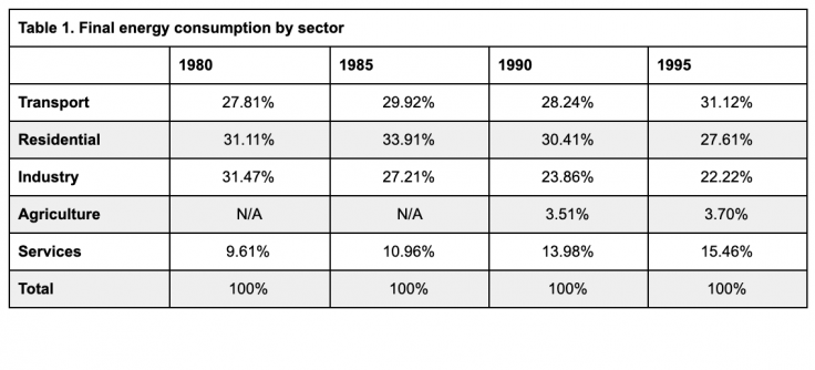
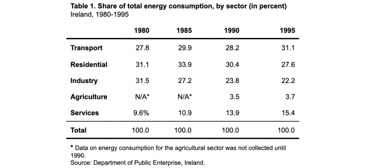
The information in the first table is not easily interpretable. The percent sign after each value unnecessarily clutters the table, and the N/A values are not explained. Similarly, the source of the data is not apparent. In the second table, the title and footer are used to indicate the source and format of the values and to explain the N/A values, reducing the text in the actual table. Other improvements include reducing the number of lines to separate different components of the table (header, data, footnote, and source). All values are right-justified and have the same number of decimal places.
5. Present data responsibly by providing scale and context
The numerical and visual context that data is presented in can change how it is interpreted, and researchers sharing their own visualizations of data should avoid inadvertently distorting the reader or viewer’s perception of the data.
The labeling of the axes can change how we see the data presented in a chart. If the axes labels do not start at zero, consider whether this distorts the relative size of differences or trends depicted. However, zero is not always a meaningful value, so judgment is needed here; see the Economist’s Why you sometimes need to break the rules in data viz for a discussion of when starting axis at values other than zero is useful.
It is also important to present enough context. Summary statistics alone may not capture the differences between datasets that are very different when presented visually.
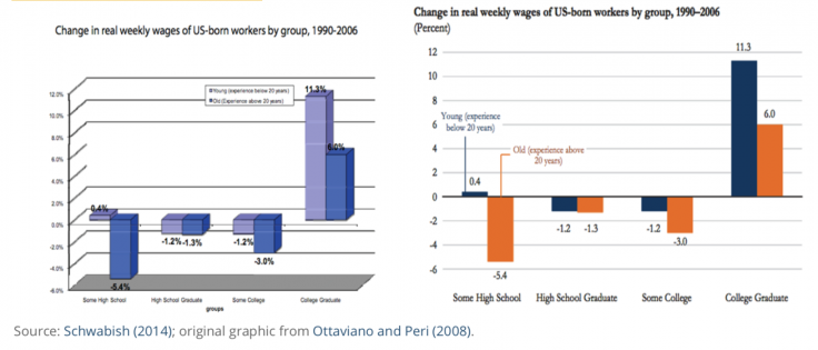
Example: How can this graph be improved?
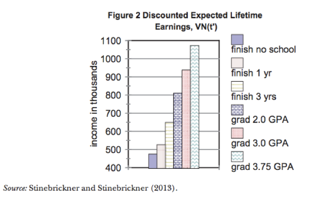
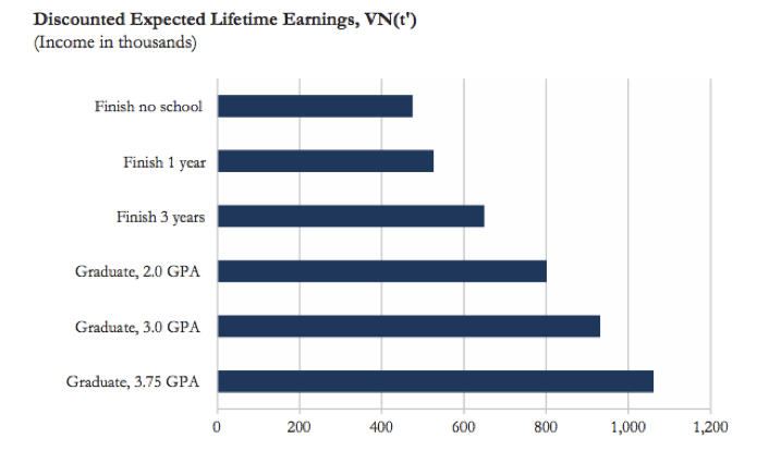
The difference between the bars in the first graph is visually misrepresented because the y-axis does not start at zero. There are also other design considerations that make the graph confusing: the combination of different colors and different patterns in each bar is unnecessary and distracting, and the legend clutters the graphic and could easily be replaced by clear axis labels. The second graph from Schwabish (2014) revises the original colorful bar chart to be clearer and easier to interpret correctly. Alternatively, if the goal of the graphic is to show the increase in expected earnings in each category compared to “Finish no school” you could reformat the graph to show the difference in expected earnings for each category, relative to “Finish no school”. This would ensure the y-axis starts at zero, and would make the differences in expected earnings more salient.
6. Eliminate junk
A clear and high-impact data visualization conveys exactly the information needed, without distracting clutter that can make interpretation difficult. When evaluating a graphic to eliminate junk, consider four key points:
- Maximize the data-to-ink ratio by using as little ink as possible to show your data (e.g., avoid the use of 3D graphs for two-dimensional data and remove unnecessary non-data ink such as gridlines).
- Remove redundant data (e.g., use of y-axis scale and numeric labels, except if needed for precision).
- Remove indicators you don’t need.
- Display summary statistics and regression coefficients with only as many decimal places as necessary given the scale of your outcome variable. For example, income in USD should almost never include any decimal places, percentages should be integers except for when the data has a narrow range, and years of education does not require decimals beyond the tenth decimal place. For further guidance on precision, see Cole (2015).
Example: Revising a graphic
Schwabish (2014) includes several examples on how to revise graphics to create more effective data visualizations, including the example below on how to transform a 3D chart. In the original version on the left, the chart uses a 3D format to show two-dimensional data, the bar colors are not easily distinguishable, and the legend is small and difficult to read. The revised version makes design choices that showcase a clearer and more readable presentation of the data.
7. Represent uncertainty with care
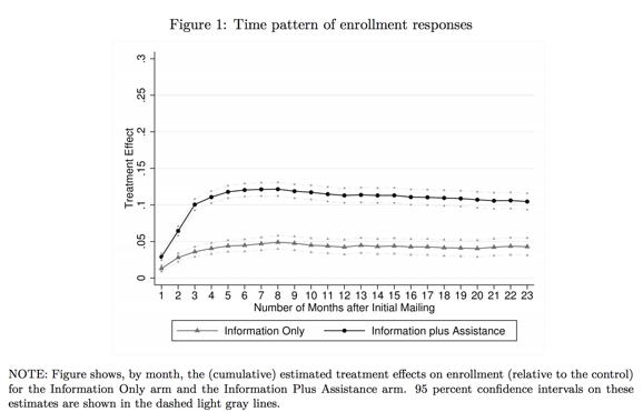
All estimates come with uncertainty, but it can be difficult to depict this in graphs and figures. Jessica Hullman and Matthew Kay write more about what goes into visualizing uncertainty in this first post of their series on the topic. When choosing how to represent uncertainty in a visualization, think about what statistic you will use. For example, confidence intervals can be clearer and easier to interpret than p-values on a graph.
In the figure below, the confidence intervals clearly depict the uncertainty but do not distract from the point estimates.
Considerations when graphing uncertainty:
- You DO want to represent uncertainty
- Represent uncertainty without creating visual clutter
- Represent uncertainty in a way that will make sense to your audience (consider their statistical background and familiarity with the concepts)
8. Use color thoughtfully
The software you use for data analysis and coding your data visualizations likely has preset default colors and layouts for graphs and charts. For example, standard Stata graph background colors add junk to the page, as mentioned in principle 4. Changing default line colors or backgrounds with your audience and intended publication medium in mind can result in a cleaner, more polished graphic and prepares you to meet journal or audience requirements later.
- Be intentional and deliberate in choosing colors such that the colors support the points the graph aims to convey. Colors should not be used simply for aesthetic reasons.
- Use sequential or diverging color schemes to show increasing or decreasing values or levels.
- For qualitative data visualizations, use a color palette designed for qualitative data.
- Viewers may be color blind. Use color blind-friendly palettes, which are sometimes required for accessibility. (For example, U.S. government agencies may require 508 compliance for colors.) Consider using a color blindness simulator to determine if your visualization is difficult to see.
- Journals may require grayscale, or your audience may print your graph in black and white. Check that your colors will translate well to grayscale.
- Limit the number of colors used. If your visualization has more than seven colors, consider ways to recategorize the data to reduce the number (e.g., recategorize several groups as an “other” category).
There are many tools for picking color palettes, but colorbrewer2.org is a good starting point. Its palettes are designed for working with maps, but are applicable to any graphic. Select options for color blind-friendly colors, as well as sequential, diverging, or qualitative color palettes, and output exact colors in HEX, RGB, or CMYK format to be used directly in code.
See the Resources section below for additional color tools.
Coding data visualizations in Stata and R
In the table below, we list some graphics you may create or come across in your work, along with Stata and R commands to generate them. While most of the R commands below focus on the ggplot2 package, a number of code options exist. For detailed sample code and output examples for these graphics and a wide range of others, refer to the Stata and R resources at the end of this page.
Tip: If you see a figure or graphic you like in a published paper and want to learn how it is coded or replicate it for your own purposes, look for the paper’s replication files to find the code.
| Type of graphic | Stata command | ggplot command (R) |
| Density plot | histogram | geom_histogram() |
| kdensity | geom_density() | |
| Box plot | graph hbox; graph box | geom_boxplot() |
| Scatter plot with fitted line | twoway scatter twoway scatter a b || lfit a b | geom_point() geom_point() + geom_abline |
| Regression coefficient plot | coefplot | coefplot |
| Line graph | twoway line | geom_line() |
| Area chart | twoway area | geom_area() |
| Bar graph | graph bar; graph hbar; twoway bar | geom_bar() |
| Stacked bar graph | graph bar a b, stack | geom_bar(position = "stack") |
| Clustered bar graph | graph bar a b, over(survey_round) | geom_bar(position = "dodge", stat = identity) |
| Bar graph with standard errors | twoway (bar) (rcap) iemargins | geom_bar() + geom_errorbar() |
| Maps | maptile | geom_map geom_point |
| spmap | tmap |
Other graphics:
Explore other graphic types and be creative as you think about how to best represent your data. For example, rather than a bar chart, you might consider using a proportional Venn diagram to show sample sizes across survey rounds and highlight continuity and attrition (Stata: pvenn2; R: VennDiagram package).
| Type of table | Stata command | R package::command |
| Summary statistics | outreg2 | stargazer::stargazer() |
| estout | gt::gt() | |
| asdoc | knitr::kable() | |
| Regression tables | outreg2 | stargazer::stargazer() |
| estout | jtools::export_summs() |
Pulling it all together
This page contains many resources helpful for understanding and creating clear and effective data visualizations, and there are countless more resources available through searching online.
To summarize the principles outlined in the first section and how they can be applied to a typical Research Associate’s work, below is an example of a graph created by binning pre-intervention test scores and estimating average test score improvement and confidence intervals for each bin. The sample code and data for creating this figure in Stata and R can be found on the J-PAL Github. Note that the default Stata background colors and graph layout specifications have been customized.
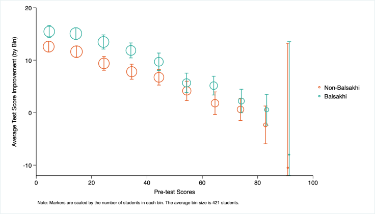
Data Source: Banerjee et al. (2017) - Harvard Dataverse
Last updated January 2024.
These resources are a collaborative effort. If you notice a bug or have a suggestion for additional content, please fill out this form.
We thank Mike Gibson and Sarah Kopper for helpful contributions.
Additional Resources
From Data to Viz: walks through types of graphs, provides code and caveats
Fundamentals of Data Visualization, Claus O. Wilke
Data stories: a podcast about data visualization with Enrico Bertini and Moritz Stefaner
Hacks: create simple LaTeX and Markdown tables interactively
Google’s Data Studio for dashboards and reports
Resources by Edward Tufte: a statistician, and political scientist who specializes in data communication: Tufte's Rules and More books and work by Tufte
J-PAL's data visualization RST lecture (J-PAL internal resource)
The United Nations’ guide to Making Data Meaningful
Color Oracle’s Color Blindness Simulator
TidyTuesday: A weekly social data project in R, focused on learning the tidyverse and ggplot packages.
Storytelling with data’s visual battle: table vs graph
Stata globals for J-PAL colors (J-PAL internal resource)
Data Workflow: complex stata graphs with replication code
Stata user written command to make customizing graphs easier
Automated table workflow in Stata, from the World Bank Blogs by Liuza Andrade, Benjamin Daniels, and Florence Kondylis
Publication quality tables in Stata: User Guide for tabout, by Ian Watson
The World Bank’s Stata Econ Visual Library
asdoc: Creating high quality tables of summary statistics in Stata
J-PAL’s Data Visualization GitHub repository: sample data and code for Stata-LaTeX integration and customizing figures in Stata and R
Quick R by Datacamp: Graphs
“How do I?” by Sharon Machlis: practical guide to coding in R
Data visualization for social science: a practical introduction with R and ggplot2
R Markdown: The Definitive Guide, by Yihui Xie, J. J. Allaire, and Garrett Grolemund
The R Markdown Cookbook, by Yihui Xie and Christophe Dervieux
The World Bank’s R Econ Visual Library
Kastellec and Leoni’s paper on using graphics instead of tables to convey results visually
Appendix B, “Statistical graphics for research and presentation” in: Gelman, Andrew, and Jennifer Hill. Data analysis using regression and multilevel/hierarchical models. Cambridge university press, 2006
Stata 18’s manual on fully replicable and customizable tables, and an example from the Stata blog
References
Cole, Tim J. 2015. “Too Many Digits: The Presentation of Numerical Data.” Archives of Disease in Childhood 100, no. 7: 608–9. https://doi.org/10.1136/archdischild-2014-307149.
Finkelstein, Amy, and Matthew J. Notowidigdo. 2019. "Take-up and targeting: Experimental evidence from SNAP." The Quarterly Journal of Economics 134(3): 1505-1556. https://doi.org/10.1093/qje/qjz013
Gentzkow, Matthew, and Jesse M. Shapiro. 2014 "Code and data for the social sciences: A practitioner’s guide." Chicago, IL: University of Chicago (2014).
Hullman, Jessica, and Kay, Matthew. “Uncertainty + visualization, explained.” The Midwest Uncertainty Collective. Last accessed July 12, 2023.
Jones, Damon, David Molitor, and Julian Reif. 2019. "What do workplace wellness programs do? Evidence from the Illinois workplace wellness study." The Quarterly Journal of Economics 134(4): 1747-1791. https://doi.org/10.1093/qje/qjz023
Ottaviano, Gianmarco IP, and Giovanni Peri. 2008. "Immigration and national wages: Clarifying the theory and the empirics." No. w14188. National Bureau of Economic Research.
Pearce, Rosamund. “Why you sometimes need to break the rules in data viz.” The Economist. Last accessed July 12, 2023.
Schwabish, Jonathan A. 2014. "An economist's guide to visualizing data." Journal of Economic Perspectives 28(1):209-34. DOI: 10.1257/jep.28.1.209
Stinebrickner, Ralph, and Todd Stinebrickner. 2014. "Academic performance and college dropout: Using longitudinal expectations data to estimate a learning model." Journal of Labor Economics 32(3): 601-644. DOI: 10.1086/675308