Visualisation des données
Summary
Les méthodes de visualisation des données peuvent être utiles à de nombreux stades du processus de recherche, de l’établissement de rapports sur les données à l’analyse et à la publication. Cette ressource aborde les principaux éléments à prendre en compte pour créer des représentations graphiques efficaces, et donne également des conseils pour faire les choix qui s’imposent en matière de mise en forme. Elle présente quelques-unes des méthodes de visualisation les plus courantes et mentionne d’autres ressources pour approfondir le sujet.
Principes fondamentaux de la visualisation des données
1. Tenez compte de votre public
Réfléchissez aux personnes qui vont consulter votre représentation graphique et à leur degré de familiarité avec les données et le contexte concernés afin de guider la mise en forme de votre visualisation. Vos représentations graphiques vont-elles servir de référence interne à votre équipe dans le cadre d’un projet en cours, ou feront-elles partie d’un rapport, d’une présentation ou d’une publication destinés à être diffusés plus largement ?
- Quel est le niveau de connaissances techniques de votre public ?
- Quelles sont les compétences linguistiques de votre public ? En quoi cela va-t-il influencer les éléments de texte que vous allez inclure ?
- Évitez les termes techniques, surtout s’il y a des chances que votre public cible ne les connaisse pas. Si des abréviations techniques sont nécessaires et adaptées à votre public, veillez toujours à les définir précisément.
- Réfléchissez à la manière dont votre public va consulter les informations (documents imprimés, ordinateur, vidéoprojecteur, etc.) et à l’impact que cela peut avoir sur vos choix de mise en forme (par exemple en matière de couleurs, qui ont souvent un rendu différent sur ordinateur, sur papier et sur vidéoprojecteur).
- La représentation graphique que vous ou l’équipe de recherche trouvez convaincante n’est pas forcément celle qui convaincra votre public : il faut donc être prêt à la modifier le cas échéant.
2. Sélectionnez le type de visualisation le plus adapté en fonction des informations que vous souhaitez communiquer
Commencez par faire votre choix entre un tableau et une figure, puis, si vous utilisez un graphique, choisissez le format qui convient le mieux au nombre de variables que vous voulez représenter, ainsi qu’à leur type (continues ou discrètes). Pour plus d’informations sur le choix du type de graphique, voir le guide des Nations Unies intitulé Making Data Meaningful ou data-to-viz.
- Utilisez un tableau si vous souhaitez représenter des valeurs numériques exactes, si vous voulez pouvoir effectuer des comparaisons multiples et localisées, ou si vous avez relativement peu de chiffres à montrer. Les tableaux constituent souvent une option plus claire et plus riche en informations.
- Utilisez un graphique si vous souhaitez mettre en évidence des constantes ou des relations entre certaines variables clés, visualiser la forme ou la distribution des données, ou encore repérer des tendances dans les variables. Les graphiques sont souvent plus faciles à mémoriser, ce qui les rend utiles pour capter l’attention du public ou pour mettre en évidence des éléments clé à retenir.
- Il est également possible de combiner un graphique et un tableau. Pour un exemple de visualisation de la température mensuelle moyenne, voir ici.
- Réfléchissez au résultat final et à son apparence. Si vous créez un graphique au moment de l’enquête initiale et que vous prévoyez de le reproduire à mi-parcours et/ou à la fin de l’étude, pensez à la manière dont vous y intégrerez les données issues des prochaines vagues d’enquête.
- Évitez les diagrammes circulaires : le public a souvent du mal à distinguer à l’œil nu la différence de taille entre les différents secteurs du diagramme. Pour représenter les parties d’un ensemble, un graphique à barres empilées représente une bonne alternative.
3. Anticipez les mises à jour : Automatisez tout
« L’une des règles de base de la recherche, c’est que l’on finit toujours par devoir exécuter chaque étape plus de fois qu’on ne le pensait. Or, le coût que représente la répétition d’une série d’opérations manuelles dépasse rapidement le coût d’un investissement unique dans un outil réutilisable. »
(Gentzkow et Shapiro, 2014)
Le flux de travail qui permet de produire les représentations graphiques joue un rôle important en termes d’efficacité et de portabilité.
- Automatisez tout ce qui peut l’être.
- Concevez votre flux de travail de façon à ne pas avoir à recréer manuellement chaque figure et chaque tableau chaque fois que vous ajoutez de nouvelles données ou que vous ajustez une régression.
- Les modifications apportées aux graphiques dans l’éditeur de graphiques de Stata peuvent être reproductibles et automatisées. Pour plus d’informations, voir cet article du blog de la Banque Mondiale.
- Évitez autant que possible de copier-coller des figures et des tableaux d’un logiciel à un autre (par exemple, copier un graphique produit sous Stata dans Microsoft Word empêche d’automatiser l’actualisation du graphique, et donne souvent lieu à une figure de moindre qualité par ailleurs).
- Flux de travail général : Code > sortie brute > tableau, graphique ou carte mis(e) en forme
Automatiser le flux de travail qui génère et actualise les tableaux et les figures, et les compile dans un document ou une présentation fini(e), permet de gagner du temps et favorise la reproductibilité. Cet article du blog de la Banque mondiale traite de l’importance de l’automatisation et propose des flux de travail pour programmer les tableaux dans Stata.
4. Présentez des informations intelligibles
Toutes les informations qui figurent dans votre représentation graphique des données doivent pouvoir être interprétées par un être humain. Quel que soit le public cible, un certain nombre d’éléments doivent être pris en compte pour rendre les tableaux et les figures compréhensibles. Il faut notamment identifier les sections des sorties brutes du logiciel qui sont intéressantes et convertir, si nécessaire, les coefficients en valeurs pertinentes. La façon dont vous allez procéder dépend toutefois de votre public. Il faut donc réfléchir à ce dernier (lecteurs d’une revue, public d’une présentation, partenaires externes) et à la manière dont il va aborder et assimiler les informations que vous lui présenterez. Veillez à toujours inclure des éléments de contexte pour aider votre public à interpréter les informations, que ce soit à l’oral dans le cadre d’une présentation ou à l’écrit dans les titres et légendes de vos tableaux et graphiques.
- Principe fondamental : Ne présentez que des informations interprétables par un être humain.
- La plupart des tableaux et des figures doivent être suffisamment explicites pour se suffire à eux-mêmes. Les lecteurs expérimentés consultent souvent les tableaux et les figures avant le reste.
- Faites attention à certains chiffres difficiles à interpréter qui apparaissent souvent dans les tableaux :
- Les coefficients logit : Les gens ne réfléchissent pas en termes de logit : transformez ces coefficients en probabilités estimées et représentez-les graphiquement.
- Les mesures de la qualité de l’ajustement statistique n’ont souvent pas beaucoup de sens, même pour un lecteur expert.
- Réfléchissez aux chiffres et aux graphiques qui risquent d’encombrer inutilement le document et d’être difficiles à interpréter (voir principe 6).
- Évitez le jargon et les abréviations techniques.
- Utilisez la couleur et la transparence pour renforcer votre message : nos yeux interprètent facilement les variations de couleurs et de transparence (voir le principe 8 pour plus d’informations sur le choix des couleurs).
- Intégrez des textes explicatifs, tels que des légendes pour les figures et des titres clairs et descriptifs, afin de guider votre public.
Exemple : Comment ce tableau peut-il être amélioré ?
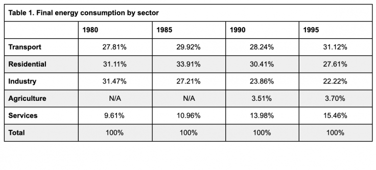
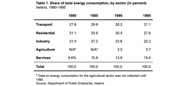
Les informations du premier tableau ne sont pas facilement interprétables. Le signe du pourcentage qui suit chaque valeur encombre inutilement le tableau, et les valeurs « N/A » ne sont pas expliquées. De même, la source des données n’est pas mentionnée. Dans le deuxième tableau, le titre et le texte en bas du tableau sont utilisés pour préciser la source et le format des valeurs, limiter la quantité de texte dans le tableau proprement dit et expliquer les valeurs sans objet. Parmi les autres améliorations, citons la réduction du nombre de lignes, puisque seules les lignes qui séparent les différents éléments du tableau (en-tête, données, note de bas de page et source) sont conservées. Toutes les valeurs sont justifiées à droite et comportent le même nombre de décimales. <
5. Présentez les données de manière responsable en précisant l’échelle et le contexte
Le contexte numérique et visuel dans lequel sont présentées les données peut modifier la façon dont elles vont être interprétées, et les chercheurs qui présentent leurs propres visualisations doivent éviter de déformer sans le vouloir la perception que le lecteur ou l’observateur va avoir de ces données.
Dans un graphique, par exemple, le choix des étiquettes d’axe peut modifier la façon dont sont perçues les données représentées. Si ces étiquettes ne partent pas de zéro, il faut se demander si cela ne fausse pas l’importance relative des différences ou des tendances représentées. Cependant, zéro n’est pas toujours une valeur significative, et il est donc nécessaire de faire preuve de jugement. Pour savoir quand il peut être utile de partir d’une valeur autre que zéro, consultez l’article de The Economist intitulé « Why you sometimes need to break the rules in data viz ».
Il est important également de fournir suffisamment de contexte. À elles seules, des statistiques sommaires ne suffisent pas forcément à mettre en évidence les différences entre des ensembles de données qui sont très différents lorsqu’ils sont représentés visuellement.
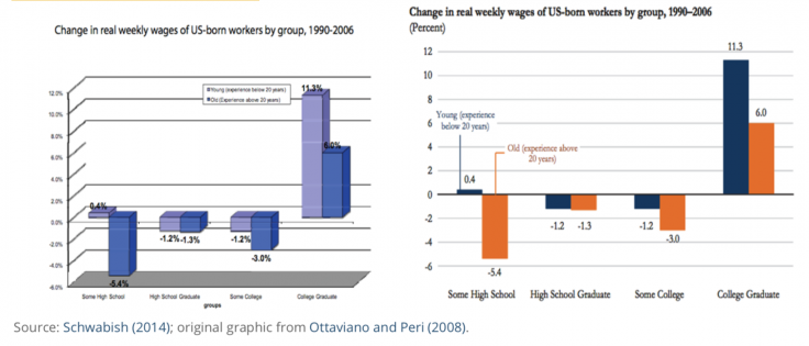
Exemple : Comment ce graphique peut-il être amélioré ?
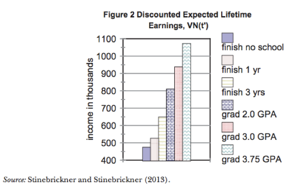
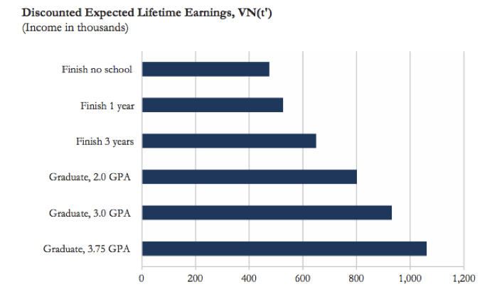
Dans le premier graphique, la différence entre les barres est représentée de manière trompeuse car l’axe des ordonnées ne part pas de zéro. D’autres éléments de mise en forme nuisent également à la lisibilité de ce graphique : la combinaison de différentes couleurs et de différents motifs dans chaque barre est inutile et gênante, et la légende encombre le graphique alors qu’elle pourrait facilement être remplacée par des étiquettes d’axe claires et précises. Le second graphique de Schwabish (2014) reprend le graphique en barres coloré d’origine pour le clarifier et en faciliter l’interprétation. Par ailleurs, si l’objectif du graphique est de montrer la hausse des revenus attendus dans chaque catégorie par rapport à la situation des répondants n’ayant terminé aucun cursus scolaire (l’option « Finish no school »), le graphique pourrait être modifié pour montrer la différence entre les revenus attendus dans chaque catégorie par rapport à la catégorie « Finish no school ». Cela permettrait de faire partir l’axe des ordonnées de zéro tout en faisant apparaître les différences entre les revenus attendus de manière plus évidente.
6. Éliminez le superflu
Pour être claire et efficace, une visualisation de données ne doit contenir que les informations qui sont strictement nécessaires, sans s’encombrer d’éléments superflus susceptibles d’en compliquer l’interprétation. Lorsque vous examinez un graphique en vue d’en éliminer les éléments superflus, gardez à l’esprit les quatre principes suivants :
- Optimisez le ratio données/encre en utilisant le moins d’encre possible pour représenter vos données.
- Éliminez tout ce qui n’est pas lié aux données (par exemple, les lignes de quadrillage superflues).
- Supprimez les données redondantes.
- Supprimez les indicateurs dont vous n’avez pas besoin.
- Pour les statistiques sommaires et les coefficients de régression, n’affichez que le nombre de décimales qui est nécessaire ou pertinent au vu de l’échelle de votre variable de résultat. Par exemple, les revenus en dollars américains ne doivent presque jamais comporter de décimales, pas plus que les pourcentages ; le nombre d’années d’études nécessite rarement des décimales au-delà du dixième, etc.
Exemple : Réviser un graphique
Schwabish (2014) donne plusieurs exemples de révision de graphiques visant à créer des visualisations de données plus efficaces, notamment l’exemple ci-dessous qui explique comment transformer un graphique en 3D. Dans la version originale présentée à gauche, le graphique utilise un format 3D pour présenter des données bidimensionnelles, les couleurs des barres ne sont pas faciles à distinguer les unes des autres, et la légende est petite et difficile à lire. La version révisée fait des choix de mise en forme qui permettent de représenter les données de façon plus claire et plus lisible.
7. Soyez particulièrement attentifs à la représentation de l’incertitude
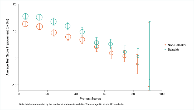
Toute estimation comporte une part d’incertitude, qu’il peut être difficile de représenter dans les graphiques et les figures. Jessica Hullman et Matthew Kay expliquent plus en détail comment représenter visuellement l’incertitude dans le premier article de leur série consacrée à ce sujet. Pour déterminer comment représenter l’incertitude dans une représentation graphique, réfléchissez aux statistiques que vous allez utiliser. Par exemple, les intervalles de confiance sont souvent plus clairs et plus faciles à interpréter que les valeurs-p dans un graphique.
Par exemple, dans la figure ci-dessous, les intervalles de confiance illustrent clairement la part d’incertitude, sans pour autant détourner l’attention des estimations ponctuelles.
Éléments à prendre en compte pour représenter l’incertitude :
- Il FAUT représenter l’incertitude
- Représentez l’incertitude sans pour autant provoquer d’encombrement visuel
- Représentez l’incertitude sous une forme qui sera compréhensible pour votre public, en tenant compte de ses connaissances en statistiques et de son degré de familiarité avec les concepts abordés
8. Faites un usage réfléchi des couleurs
Le logiciel que vous utilisez pour analyser vos données et programmer vos visualisations de données dispose probablement d’options par défaut pour les couleurs et la mise en page des graphiques et des diagrammes. Par exemple, sous Stata, les couleurs standard d’arrière-plan des graphiques donnent une impression de surcharge visuelle sur la page, ce qui va à l’encontre du principe 4. Modifier la couleur des lignes ou l’arrière-plan par défaut en fonction de votre public cible et du support de publication ou de diffusion prévu peut permettre d’obtenir un graphique plus propre et plus soigné et vous éviter d’avoir à refaire la palette de couleurs pour répondre aux exigences d’une revue ou aux besoins du public par la suite.
- Utilisez des palettes séquentielles ou divergentes pour représenter des valeurs ou des niveaux croissants ou décroissants.
- Pour représenter des données qualitatives, utilisez une palette de couleurs conçue pour ce type de données.
- Il est possible que certains membres de votre public soient daltoniens. Utilisez des palettes adaptées aux personnes daltoniennes, qui sont parfois exigées pour des raisons d’accessibilité. (Par exemple, les agences gouvernementales américaines exigent parfois le respect des normes 508 en matière de couleurs). Envisagez d’utiliser un simulateur de daltonisme pour déterminer si votre visualisation est difficile à voir.
- Certaines revues demandent l’utilisation de niveaux de gris. Dans ce cas, pensez à vérifier que les couleurs que vous utilisez passent bien en niveaux de gris.
- Limitez le nombre de couleurs utilisées. Si votre visualisation comporte plus de sept couleurs, réfléchissez à la possibilité de recatégoriser certaines données pour en réduire le nombre (par exemple en regroupant plusieurs groupes pour former une catégorie « autre »).
De nombreux outils permettent de sélectionner des palettes de couleurs, mais colorbrewer2.org constitue un bon point de départ. Les palettes de ce site sont conçues pour les travaux de cartographie, mais sont également applicables à n’importe quel type de représentation graphique. Sélectionnez les options souhaitées, notamment des couleurs adaptées aux personnes daltoniennes, ainsi que des palettes séquentielles, divergentes ou qualitatives, et générez les couleurs exactes au format HEX, RVB ou CMJN pour les utiliser directement dans le code.
Vous trouverez d’autres outils pour les couleurs dans la section Ressources ci-dessous.
Programmer les visualisations de données sous Stata et sous R
Le tableau ci-dessous répertorie plusieurs types de représentations graphiques que vous pouvez être amenés à créer ou à rencontrer dans le cadre de votre travail, ainsi que les commandes Stata et R qui permettent de les générer. Bien que la plupart des commandes R énumérées ci-dessous appartiennent au package ggplot2, il existe plusieurs options de programmation. Pour des exemples détaillés de code et de rendu final de ces représentations graphiques et de bien d’autres encore, consultez les ressources sur Stata et R qui figurent en bas de cette page.
Conseil : Si vous trouvez une figure ou un graphique qui vous plaît dans un article publié et que vous souhaitez savoir comment il a été codé ou le reproduire à vos propres fins, vous pouvez consulter les fichiers de réplication de l’article pour en trouver le code.
| Type de représentation graphique | Commande Stata | Commande ggplot (R) |
| Diagramme de densité | histogram | geom_histogram() |
| kdensity | geom_density() | |
| Diagramme en boîte | graph hbox; graph box | geom_boxplot() |
| Nuage de points avec droite de régression | twoway scatter twoway scatter a b || lfit a b | geom_point() geom_point() + geom_abline |
| Graphique des coefficients de régression | coefplot | coefplot |
| Graphique linéaire | twoway line | geom_line() |
| Graphique en aires | twoway area | geom_area() |
| Graphique à barres | graph bar; graph hbar; twoway bar | geom_bar() |
| Graphique à barres empilées | graph bar a b, stack | geom_bar(position = "stack") |
| Graphique à barres groupées | graph bar a b, over(survey_round) | geom_bar(position = "dodge", stat = identity) |
| Graphique à barres avec erreurs-types | twoway (bar) (rcap) iemargins | geom_bar() + geom_errorbar() |
| Cartes | maptile | geom_map geom_point |
| spmap | tmap |
Autres types de représentations graphiques :
Explorez d’autres types de représentations graphiques et faites preuve de créativité lorsque vous réfléchissez à la meilleure façon de représenter vos données. Par exemple, au lieu d’utiliser un graphique à barres pour représenter la taille de l’échantillon dans les différentes vagues d’enquête, on pourrait envisager d’utiliser un diagramme de Venn proportionnel, ce qui permettrait d’illustrer la continuité et l’attrition (Stata : pvenn2 ; R : package VennDiagram).
| Type de tableau | Commande Stata | R package::commande |
| Statistiques sommaires | outreg2 | stargazer::stargazer() |
| estout | gt::gt() | |
| asdoc | knitr::kable() | |
| Tableaux de régression | outreg2 | stargazer::stargazer() |
| estout | jtools::export_summs() |
Synthèse
Cette page contient de nombreuses ressources utiles pour comprendre et créer des visualisations de données à la fois claires et efficaces, et il en existe bien d’autres que vous pouvez trouver en effectuant une recherche en ligne.
Pour résumer les principes énoncés dans la première section et la manière dont ils s’appliquent au travail classique d’un assistant de recherche de J-PAL, voici un exemple de graphique créé sous Stata avec la commande binscatter par Robbie Dulin, assistant de recherche de J-PAL. Notez que les options par défaut de Stata en matière de couleurs d’arrière-plan et de mise en page des graphiques ont été personnalisées.
(Source: Robbie Dulin)
Dernière modification : juillet 2020.
Ces ressources sont le fruit d’un travail collaboratif. Si vous constatez un dysfonctionnement, ou si vous souhaitez suggérer l’ajout de nouveaux contenus, veuillez remplir ce formulaire.
Nous tenons à remercier Mike Gibson et Sarah Kopper pour leurs précieuses contributions. Ce document a été traduit de l’anglais par Marion Beaujard.
Additional Resources
From Data to Viz : ressource qui présente les différents types de graphiques, donne des exemples de code et formule quelques mises en garde.
Fundamentals of Data Visualization, Claus O. Wilke
Data stories : podcast sur la visualisation des données avec Enrico Bertini et Moritz Stefaner
Astuce : créez des tableaux simples en LaTeX et Markdown de manière interactive
Data Studio de Google pour les tableaux de bord et les rapports
Ressources d’Edward Tufte, statisticien et politologue spécialisé dans la communication de données : Tufte et Autres ouvrages et travaux de Tufte
Présentation sur la visualisation des données issue de la formation de J-PAL pour le personnel de recherche (ressource interne de J-PAL)
Guide de l’ONU intitulé Making Data Meaningful.
Simulateur de daltonisme de Color Oracle
TidyTuesday: Projet hebdomadaire sur les données dans R, portant sur l’apprentissage des packages tidyverse et ggplot.
Storytelling with data : bataille visuelle : tableau contre graphique
Macros globales de Stata pour les couleurs de J-PAL (ressource interne de J-PAL)
Data Workflow: graphiques complexes sous Stata avec code de réplication
Commande Stata écrite par les utilisateurs pour faciliter la personnalisation des graphiques
Flux de travail automatisé pour les tableaux dans Stata, tiré du blog de la Banque mondiale par Liuza Andrade, Benjamin Daniels, et Florence Kondylis
Publication quality tables in Stata: User Guide for tabout, Ian Watson
Stata Econ Visual Library, la Banque Mondiale
asdoc: Creating high quality tables of summary statistics in Stata
J-PAL’s Data Visualization GitHub repository: sample data and code for Stata-LaTeX integration and customizing figures in Stata and R
Quick R by Datacamp: Graphs
“How do I?” de Sharon Machlis: guide pratique de la programmation en R
Visualisation de données pour les sciences sociales : introduction pratique avec R et ggplot2
R Markdown: The Definitive Guide, by Yihui Xie, J. J. Allaire, and Garrett Grolemund
The R Markdown Cookbook, by Yihui Xie and Christophe Dervieux
R Econ Visual Library, Banque Mondiale
The World Bank’s R Econ Visual Library
Article de Kastellec et Leoni sur le remplacement des tableaux par des graphiques pour représenter visuellement les résultats.
Annexe B, “Statistical graphics for research and presentation” dans : Gelman, Andrew, and Jennifer Hill. Data analysis using regression and multilevel/hierarchical models. Cambridge university press, 2006
Lokshin, Michael and Zurab Sajaia. 2008. “Creating print-ready tables in Stata.” The Stata Journal 3(8):374-389. https://journals.sagepub.com/doi/pdf/10.1177/1536867X0800800304
References
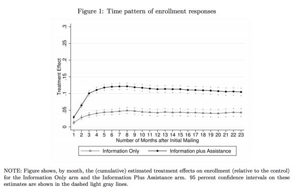
- Finkelstein, Amy, and Matthew J. Notowidigdo. 2019. "Take-up and targeting: Experimental evidence from SNAP." The Quarterly Journal of Economics 134(3): 1505-1556. https://doi.org/10.1093/qje/qjz013
- Gentzkow, Matthew, and Jesse M. Shapiro. 2014 "Code and data for the social sciences: A practitioner’s guide." Chicago, IL: University of Chicago (2014).
- Hullman, Jessica, and Kay, Matthew. “Uncertainty + visualization, explained.” The Midwest Uncertainty Collective. Dernière consultation le 9 juin 2020.
- Jones, Damon, David Molitor, and Julian Reif. 2019. "What do workplace wellness programs do? Evidence from the Illinois workplace wellness study." The Quarterly Journal of Economics 134(4): 1747-1791. https://doi.org/10.1093/qje/qjz023
- Ottaviano, Gianmarco IP, and Giovanni Peri. 2008. "Immigration and national wages: Clarifying the theory and the empirics." No. w14188. National Bureau of Economic Research.
- Pearce, Rosamund. “Why you sometimes need to break the rules in data viz.” The Economist. Dernière consultation le 12 novembre 2020.
- Schwabish, Jonathan A. 2014. "An economist's guide to visualizing data." Journal of Economic Perspectives 28(1):209-34. DOI: 10.1257/jep.28.1.209
- Schwabish, Jonathan A. (2012, December, 15). Visualizing Data: An Economists’ Guide to Presenting Data. American Association for Budget and Program Analysis Conference, Washington, D.C.
- Stinebrickner, Ralph, and Todd Stinebrickner. 2014. "Academic performance and college dropout: Using longitudinal expectations data to estimate a learning model." Journal of Labor Economics 32(3): 601-644. DOI: 10.1086/675308